

Started by ethomaz, Jul 22, 2014, 03:55 PM
previous topic - next topic0 Members and 1 Guest are viewing this topic.

Simple, but at the same time a bit uninspired.
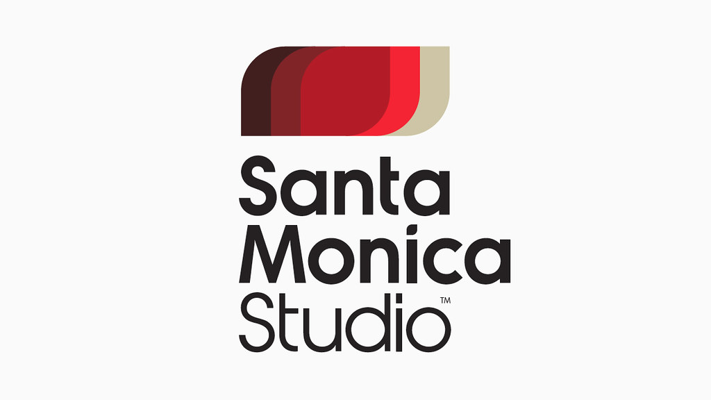
What's the bottom one? Fan photoshop?
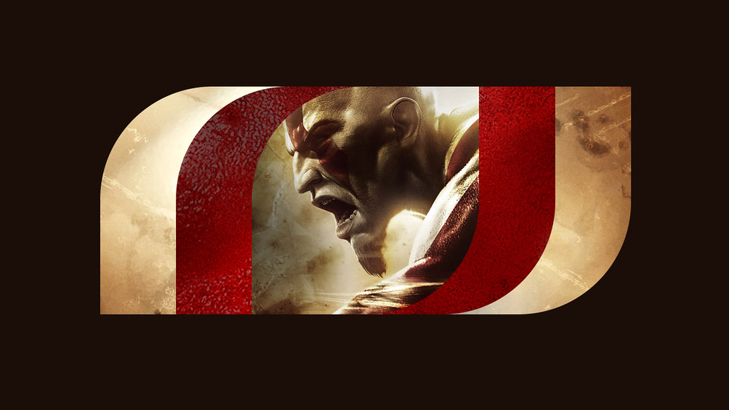
Our new logo, with its bold, simple structure can become a frame to the world of our games, filled with elements of the game such as key colors, textures, game content and screenshots. When you see the new animated logo boot up with our next external dev games such as Fat Princess: Piece of Cake and Hohokum, you'll further understand how we crafted a mark that allows our games to visually become part of the brand.


Ik like the first two the other one not so much ...
Page created in 0.100 seconds with 21 queries.