@the-Pi-guyYou put way more thought into this than I expected.

I think it's a cool concept. Has some traces of being a featural system yet isn't as "sterile" as most of those feel to me. A ton of different ways vertical and horizontal elements can be represented. It could be cooler if you embrace this distinction between verticals and horizontals even more than in your example.Ak definitely. That's what I didn't really like about ak.
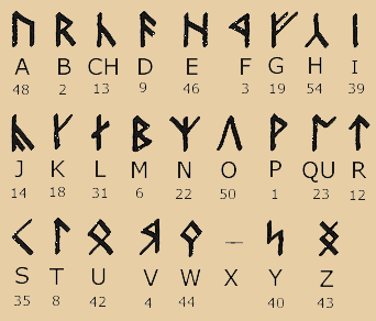
Take the Z, V, S, D, B, R, Th, T, Sh, Y, L, F, K, Ch, and W. They all have elements that have a slope of zero. Especially with something like AK, this could be confusing. A speaker would not know which horizontal lines belong to the K and which one belongs to the A unless they had experience with that specific combination.
I and O could be replaced with the horizontal lines of Z and V. Then 45 degree elements could be more common in the vertical characters, instead of only using two as a pair. IE the F character could have one instead of its horizontal bar. Sure it'd look more like the english N, but I feel it'd greatly increase clarity of the designs.I think I will try this out.
Z, V, and a few of the other characters, I was imagining them basically as pictograms. So az means down and av means up.
But I think there's a way to retain that.
Another/alternative thing you could do is make all the vowels in a word connected. The vowel of the next element would continue from the previous vowel as if they were all a single line. This could give your script a cool visual identity and additionally help with differentiating which lines belong to which parts. It might require shallowing the I and O a bit to keep the vowel line from extending too far up or down. One negative/positive about this is that combinations of vowels and consonants would look different depending on the word they're in. On one hand this makes it harder to parse the syllable directly but on the other hand it makes it easier to read whole words since additional information is encoded in each part. Two otherwise identical words that start with I and O would never be misread as the other.I think this is a cool idea.
With the actual aesthetics, the characters with just straight lines feel at odds with the characters with curves. It's pretty hard to judge though without seeing the vowels and consonants overlaid. I like the visual identity of D and F. They feel unique.One thing I think is really cool about the Japanese writing system is that it basically limits what sounds can be written. Gives a new learner a good idea of what basically constitutes a "Japanese sound".
It's a cool flip on Japanese to reverse the consonants and vowels. I imagine it would feel really weird for a native Japanese speaker to hear.