

I don't think this fits VizionEck Cube Royale but it's at least more professional looking than some other designs I've tried


Started by Legend, Mar 12, 2018, 11:09 PM
previous topic - next topic0 Members and 9 Guests are viewing this topic.
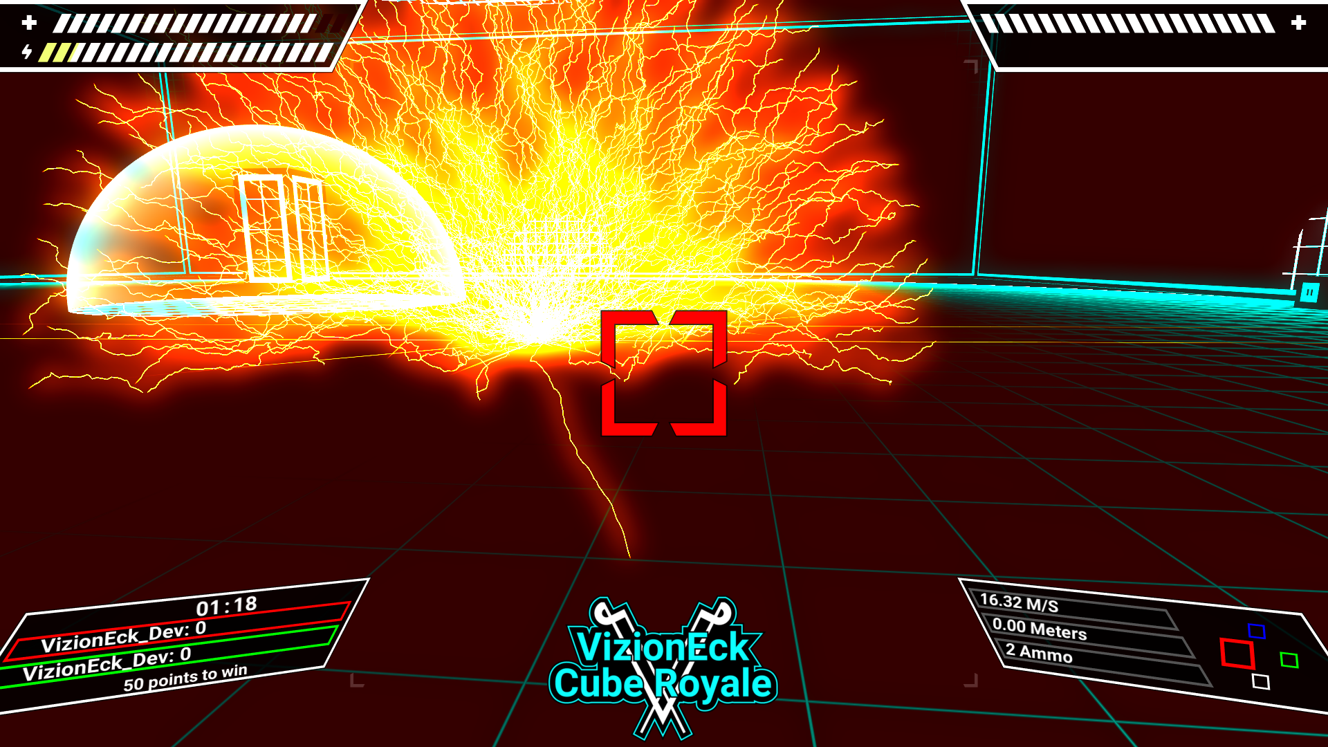
| VizionEck Cube Royale is releasing this year "I'm Mike Armbrust" -Me |  |  |
I don't think this fits VizionEck Cube Royale but it's at least more professional looking than some other designs I've tried
I think it'd look better with a crazy design around it or less blue-green.Pretty cool.
But that's a first impression.

Pretty cool.I like the color too, but I don't feel like it fits in the logo
Turquoise is one of my favorite colors!
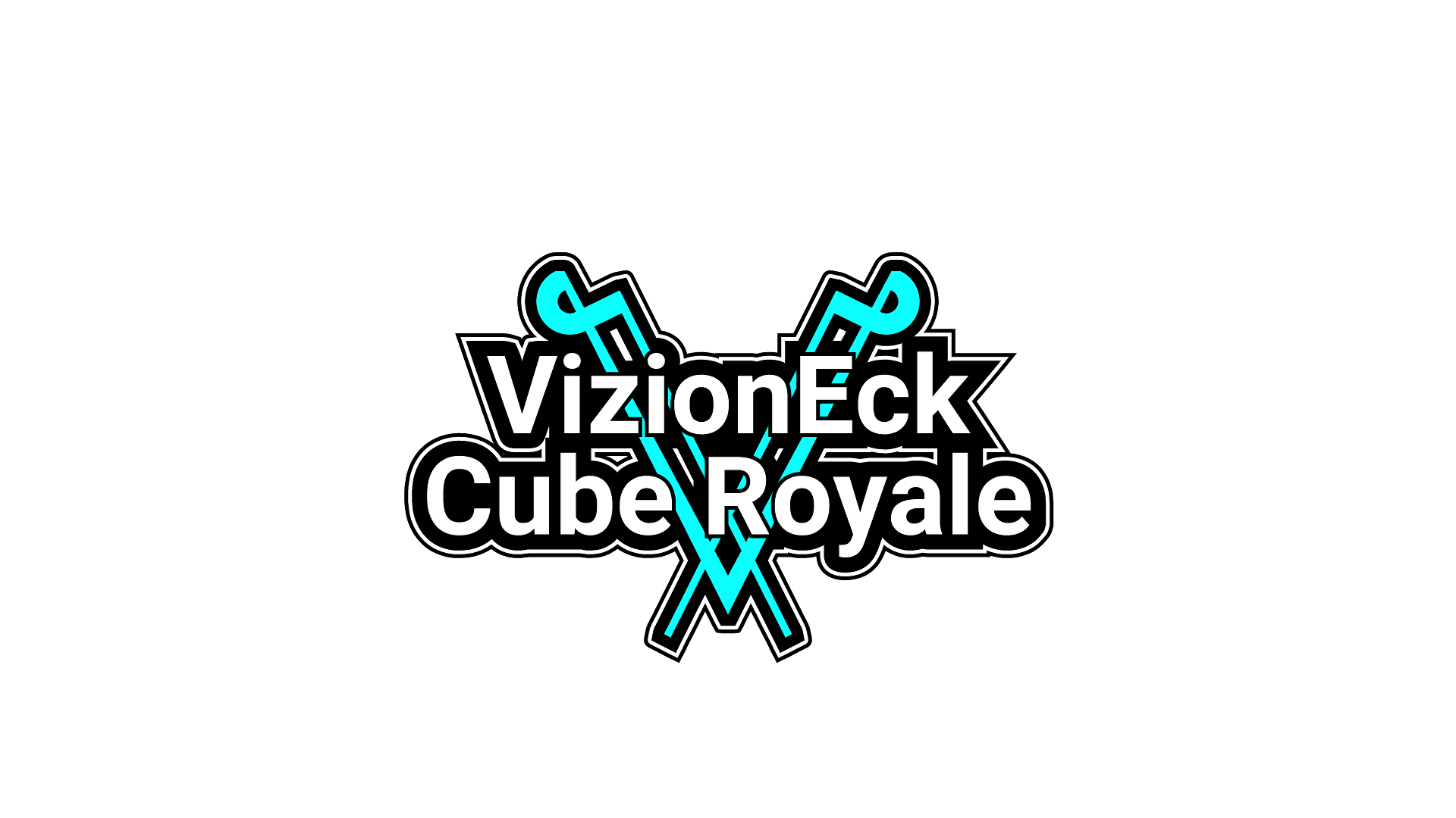
I think it'd look better with a crazy design around it or less blue-green.The color more or less matches the main color of the walls in the game. If it looks bad on its own then that's definitely a no go, but that's what I was going for.
But that's a first impression.
| VizionEck Cube Royale is releasing this year "I'm Mike Armbrust" -Me | | |
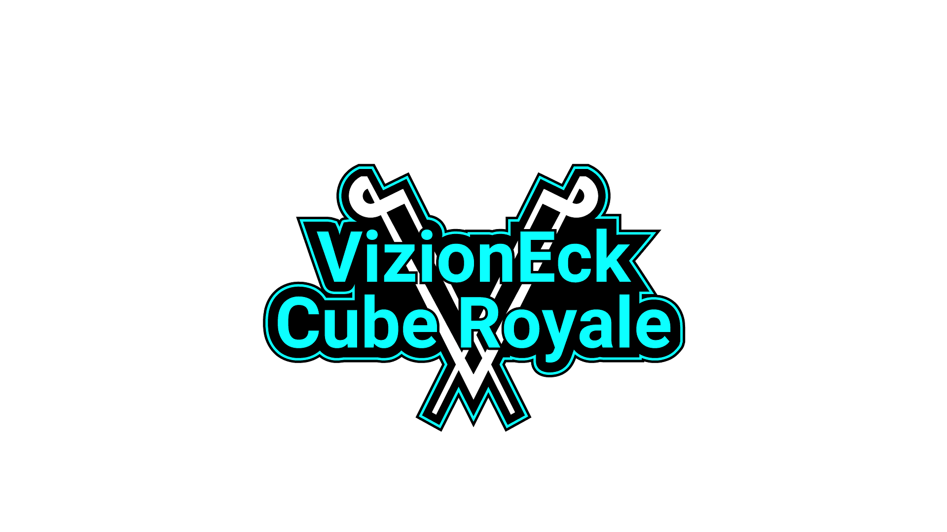
Stick with the color, try a new design (although I quite like these!).
I tried using less curves. Still not really feeling it so I'm definitely going to try a different setup.
The color more or less matches the main color of the walls in the game. If it looks bad on its own then that's definitely a no go, but that's what I was going for.
The general "feel" I think should be classy/mystic/robotic/prominent/actiony/electric. Don't think this design really works.
What engine and programs do you use to make the game?Unity, Blender, Audacity, and Gimp mostly.
I'm not a fan of the VizionEck V so to me it spoils it a little. But I do like the colours and font.I can totally get rid of it but I'd need some other design or image to replace it within the logo. Raw text would be way too boring. Any ideas?
Stick with the color, try a new design (although I quite like these!).
It's a striking color, makes the game seem immediately more interesting
I just feel like it needs a little something. Don't know what it is exactly.Thanks for the feedback. Not sure on what to try now...
It looks nice and clean though.
| VizionEck Cube Royale is releasing this year "I'm Mike Armbrust" -Me | | |


I know you guys like the values inverted.The text in turquoise liolooks good
Well, I thought I'd try.
White and turquoise switched.

| VizionEck Cube Royale is releasing this year "I'm Mike Armbrust" -Me | | |


Page created in 0.130 seconds with 23 queries.