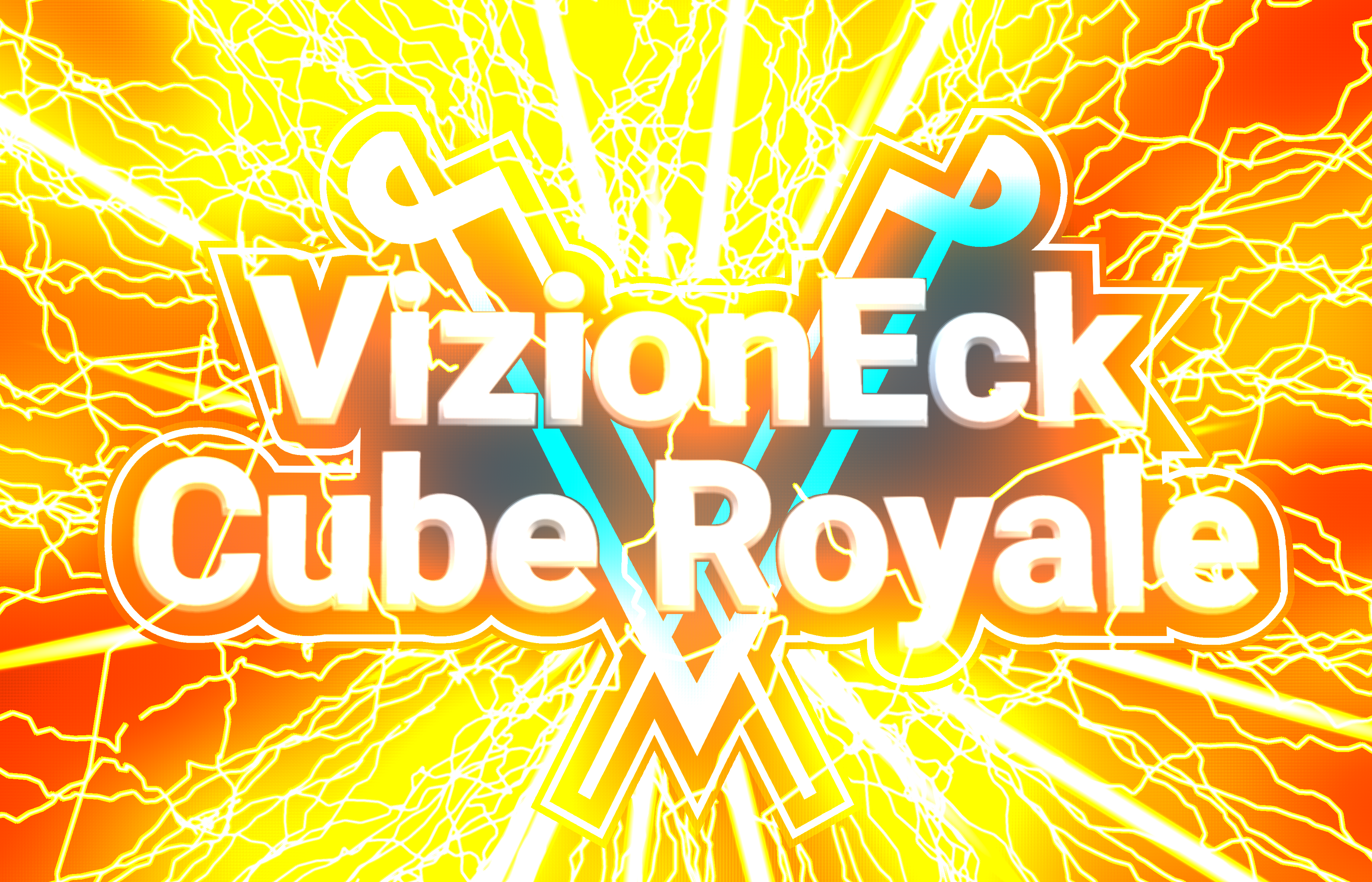
Saving the two best for last. /sNice job thinking of that. On one hand adding lightning makes the logo a lot less clean, but it also makes it a lot more exciting.
What about just the V for in game?
If you hadn't noticed, this is Forum 2.0

Started by Legend, Mar 12, 2018, 11:09 PM
previous topic - next topic0 Members and 3 Guests are viewing this topic.
Saving the two best for last. /sNice job thinking of that. On one hand adding lightning makes the logo a lot less clean, but it also makes it a lot more exciting.
What about just the V for in game?
| VizionEck Cube Royale is releasing this year "I'm Mike Armbrust" -Me |  |  |
| VizionEck Cube Royale is releasing this year "I'm Mike Armbrust" -Me | | |

Nice job thinking of that. On one hand adding lightning makes the logo a lot less clean, but it also makes it a lot more exciting.I like it because the lightning is a nice contrast to the turquoise.

Woah, turn down the brightness lol
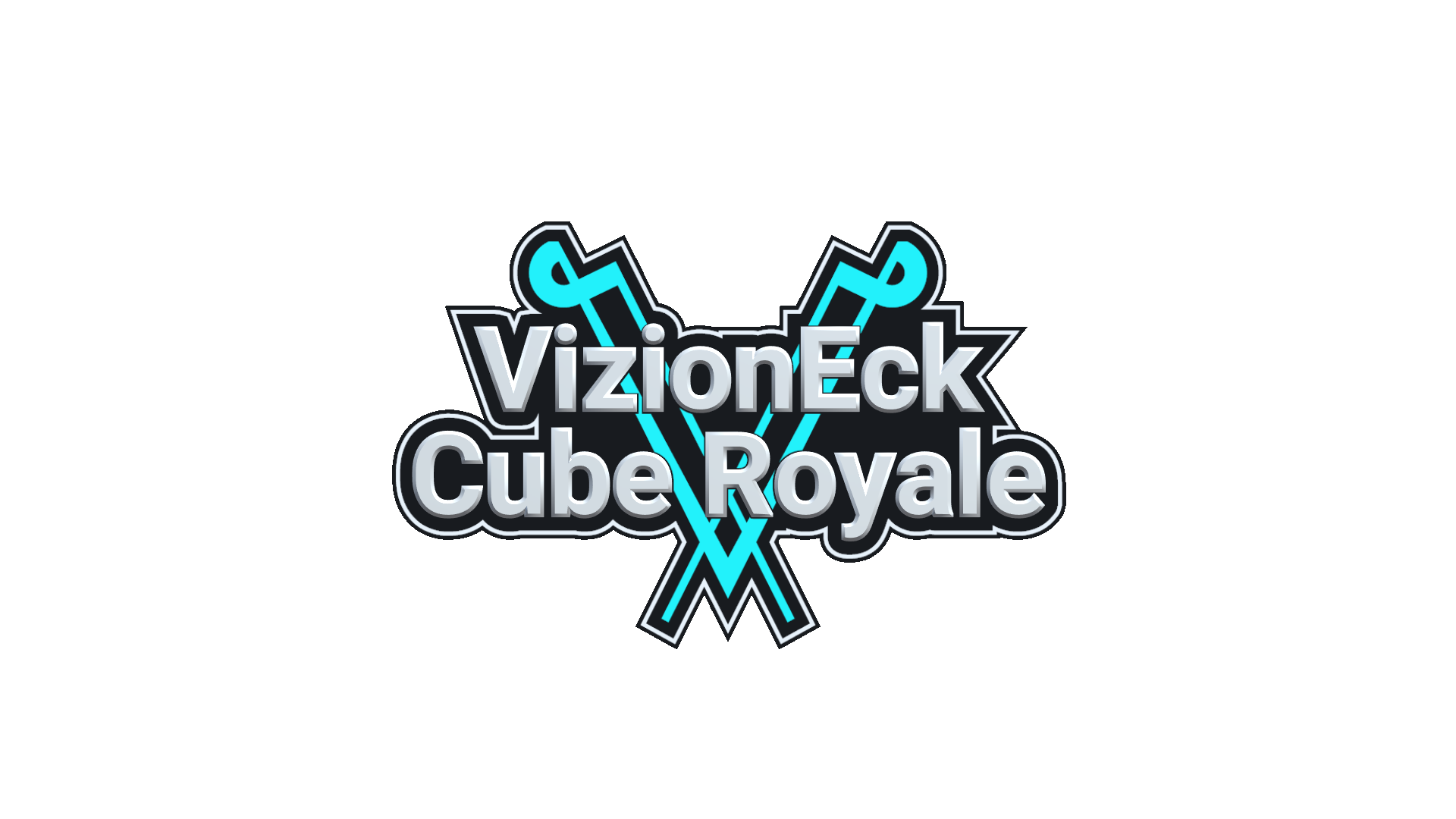
With some touchup and adjustments, this might work.

Lightning is overpowering in that one.Yeah that was just a raw screenshot from the game before I adjusted the color levels.
I like it because the lightning is a nice contrast to the turquoise.
I don't really like tooting my own horn, but I really like this one.
It still looks pretty clean, and I like the contrast.
 )
)| VizionEck Cube Royale is releasing this year "I'm Mike Armbrust" -Me | | |

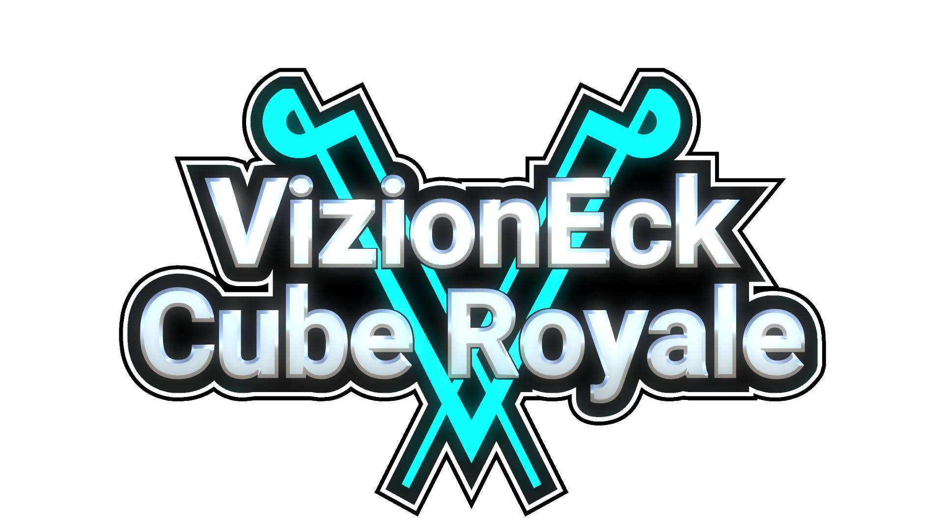

Looking at the logo today it looks better. It's grown on me.You're one of my harshest critics when it comes to naming and logos, so that's good to here!
If you do have lightning it would have to be 4 or 5 electric strands coming from the center point from behind the logo with no background to the lightning. Maybe have a few electric strands wrap around the front of the logo.
| VizionEck Cube Royale is releasing this year "I'm Mike Armbrust" -Me | | |
Looks slick. I think it looks best like this, not too complicated
Unless anyone points out something I missed, I think this is the final logo. I spent all night trying completely different concepts but none of them come close to the quality of this design. My main reservations with this logo were that it didn't fit the game emotionally, but I think I've fixed that with the metallic text and slight glow. It's way less "sticker" feeling than the early versions.
Also I like that this is an unedited screenshot from the game so it's really easy to put it in there
You're one of my harshest critics when it comes to naming and logos, so that's good to here!
| VizionEck Cube Royale is releasing this year "I'm Mike Armbrust" -Me | | |
| VizionEck Cube Royale is releasing this year "I'm Mike Armbrust" -Me | | |

| VizionEck Cube Royale is releasing this year "I'm Mike Armbrust" -Me | | |
Are there different levels of lightning?You can hold down the attack button to do stronger attacks. Light and heavy attacks are clearly defined but you can release the button in-between for a custom medium attack.
If there's like two levels, then maybe you could do both.
Otherwise, I'm having a hard time deciding. Maybe not dominate audio.
| VizionEck Cube Royale is releasing this year "I'm Mike Armbrust" -Me | | |
Quick poll since we need some forum activity todayReal lightning as long as it's not too loud
Do you think it'd be best to make the lightning sound like real lightning so a match sounds like a thunderstorm?
Or do you think the lightning should be less pronounced and not dominate the game's audio?
Page created in 0.320 seconds with 23 queries.